In the world of branding, a logo is more than just a symbol - it's a visual representation of a company's identity, values, and aspirations. Over time, some logos have become iconic, and instantly recognizable even without the brand name accompanying them. In this blog post, we embark on a journey to explore the stories and histories behind the world's most famous logos that have left an indelible mark on our collective consciousness.
Unveiling the Stories Behind the
World's Most Famous
Logos
Unveiling The Stories Behind The World's Most Famous Logos
Apple: The Bite That Changed Everything

In 1976, the Apple logo has undergone a substantial
transformation.
Ronald Wayne, a co-founder, created the original Apple logo in
1976.
Isaac Newton was pictured in the logo relaxing beneath an apple
tree. The logo depicts Newton just before an apple lands on his
head. The logo has the name of the business written on a ribbon
around it. The logo resembled a bar or an old-book store more
than
anything else.
For their initial Apple products, Steve Jobs and Steve Wozniak
commissioned Rob Janoff to create a logo in 1977. The design by
Janoff featured a straightforward, 2D apple with a bite cut out
of
it. A rainbow-colored apple with the company name Apple was used
to
symbolize knowledge, diversity, creativity, and inspiration.
Before the Macintosh was introduced in 1984, Landor & Associates
were hired, and they made a few minor changes to the logo.
Apple's
rainbow logo no longer includes the company name; all that is
visible is the Apple emblem. Over the course of the following
ten
years, this emblem served as the basis for all subsequent Apple
logos.
Apple changed their rainbow emblem to a monochromatic black
apple in
1998. The new logo was created to match the brand's luxury image
and
the new silver Mac computers. The form of the logo didn't
change.
One of the major tasks was redesigning the company's logo, which
was
a widely recognized symbol and had to be used if the business
was to
survive. Steve also completely overhauled the company's brand
image.
To match the design of their new, svelte, silver computer
models, he
took away the rainbow colors and replaced them with plain black.
This new logo would be applied to their most innovative product
to
date, the iMac, and would pave the way for a victorious
comeback.
Today, Apple has a logo that is available in three colors:
white,
black, and silver, and completely embraces a flat, minimalist
style.
It is a straightforward yet effective logo that effectively
captures
the essence of the Apple brand.
Nike: Swooshing to Success

The Nike logo was originally designed in 1964 for
Phil
Knight's Blue Ribbon Sports. The logo featured the company's name,
"Blue
Ribbon Sports", under the interlacing letters "BRS". The letters
were
unusual in shape and had stripes, but were difficult to read.
In 1971, the company changed its name to Nike, Inc. and adopted the
Swoosh as its official logo. The Swoosh was designed by Carolyn
Davidson, a graphic design student at Portland State University, for
$35. The Swoosh was a simple, curved line. Nike's co-founder, Phil
Knight, asked Davidson to create a striped logo that would stand out
from their competitors, Adidas and Puma. Davidson was given only one
request: the logo had to look like speed.
The name "Nike" is derived from the Greek goddess of victory, and
the
logo's design captures the essence of triumph and achievement. Over
the
years, the Swoosh has become synonymous with athletic excellence and
determination.
Beyond its role as a corporate emblem, the Swoosh has become a
cultural
icon. It has been emblazoned on the jerseys of legendary athletes,
adorned by sports enthusiasts worldwide, and even graced fashion
runways. The Swoosh is more than a logo; it is a symbol of
aspiration,
determination, and the pursuit of excellence.
The story of Nike's Swoosh is a testament to the power of design and
symbolism. It is a reminder that a well-crafted logo can transcend
its
origins to become a universal emblem of inspiration. From its humble
beginnings as a sketch on a piece of paper, the Swoosh has evolved
into
a globally recognized symbol of athleticism, innovation, and
triumph.
Its legacy serves as a beacon for generations of athletes and
dreamers,
urging them to push beyond their limits and "Just Do It."
McDonald's: The Golden Arches of Familiarity
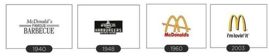
In 1940, Richard and Maurice McDonald opened their
first restaurant in San Bernardino, California. Initially, it was
named
"McDonald's Bar-B-Que," reflecting its focus on barbecue-style menu
items.
In 1948, the company introduced the character known as "Speedee," a
winking chef wearing a chef's hat and holding a hamburger. Speedee
represented the quick and efficient service that McDonald's aimed to
provide. This logo addition further solidified the brand's identity
and
was a staple of the McDonald's logo for over a decade.
In 1960, the brand decided to streamline its logo by removing
Speedee
and focusing on a more modern, typographic design. The arches, which
had
become instantly recognizable, were now incorporated into the letter
"M." The company also introduced a new font style, giving the logo a
sleek and contemporary look. This version of the logo endured for
over
four decades, demonstrating the enduring power of the golden arches.
In 2003, McDonald's took a bold step by simplifying its logo even
further. The golden arches were retained, but they were now
displayed in
a 3D perspective. The company also opted for a more vibrant shade of
yellow, symbolizing energy and vitality. This iteration marked a
shift
towards a more minimalist and clean aesthetic, aligning with
contemporary design trends.
The moment you see the golden arches, you're likely craving some
delicious fast food. McDonald's logo has undergone several
transformations, but the iconic golden arches have remained a
constant.
Designed to resemble an "M" for "McDonald's," the arches also
subconsciously evoke a feeling of comfort and familiarity. The
choice of
colour, yellow, is associated with happiness and positivity,
creating a
lasting impact on hungry customers around the world.
Coca-Cola: Scripting Happiness
The iconic Coca-Cola logo has become a symbol of refreshment and happiness worldwide. Over the years, this emblematic design has undergone several transformations, each reflecting the brand's commitment to staying relevant while maintaining its timeless appeal.
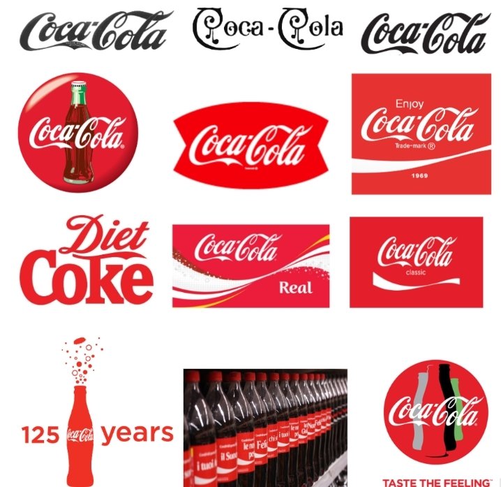
1887-1890s - Inserting the trademark
The Coca-Cola story began in 1886 when John S. Pemberton created the secret formula for the renowned beverage. Just a year later, in 1887, the first Coca-Cola logo emerged. It featured a distinct script font that proudly bore the trademark symbol.
1890-1891 - Extra swirls
As the 1890s rolled in, Coca-Cola's logo received a subtle but significant tweak. The script font was further embellished with elegant swirls, adding a touch of sophistication to the brand's image. This modification reflected Coca-Cola's growing popularity and its aspiration to be more than just a beverage – it was fast becoming a cultural phenomenon.
1941-1960s - Tail tweak
With the onset of the 1940s, the Coca-Cola logo saw another evolution. This time, attention was directed towards the distinctive "C" and "a" letters, with slight alterations to their tails. The result was a more balanced and visually appealing script, reflecting the brand's commitment to precision and quality.
1947-1960s - The Coca-Cola Red Disc
In 1947, the iconic Coca-Cola Red Disc made its debut. This bold, red background with a white script instantly became synonymous with the brand. It not only served as a powerful visual anchor but also emphasized Coca-Cola's commitment to consistency and reliability.
1958-1960s - A fishy shape
During the late 1950s, the Coca-Cola logo underwent a playful transformation. The swirls and tails were subtly reshaped, resembling a fish's tail. This whimsical touch added a dash of personality to the brand, reflecting Coca-Cola's ability to adapt and evolve with the times.
1969 - That white wave
In 1969, Coca-Cola unveiled a significant redesign featuring a dynamic, white wave beneath the script. This wave symbolized the refreshing and effervescent nature of the drink, creating a visual representation of the joy that Coca-Cola brings to its consumers.
1982 - Diet Coke
The 1980s brought about the introduction of Diet Coke, a monumental milestone for the brand. To differentiate this new product, Coca-Cola introduced a sleek and modern logo that communicated a sense of lightness and vitality, reflecting the essence of the diet beverage.
2003 - Keeping it real
In 2003, Coca-Cola returned to its roots with a refined version of its classic script font. This move reaffirmed the brand's commitment to authenticity and heritage while staying in sync with contemporary design sensibilities.
2007 - A classic design
In 2007, Coca-Cola celebrated its enduring legacy by reverting to the classic red disc logo. This decision reinforced the timeless nature of the brand and its unyielding connection with generations of consumers around the world.
2011 - 125 years of happiness
The year 2011 marked a significant milestone for Coca-Cola - its 125th anniversary. To commemorate this momentous occasion, the logo received a celebratory treatment, reminding the world of the enduring happiness and joy that Coca-Cola continues to bring to people's lives.
2013 - 2014 - Your name, that classic font
In 2013, Coca-Cola embarked on a groundbreaking marketing campaign, replacing its logo with individual names. This innovative approach not only personalized the brand but also showcased the enduring power of the classic Coca-Cola font.
2016 - “Taste the Feeling”
The most recent evolution in 2016 aligned the Coca-Cola logo with its global marketing campaign, "Taste the Feeling". This update emphasized the brand's emotional connection with consumers, highlighting the shared experiences and moments of happiness that Coca-Cola facilitates.
Adidas: The Triad of Triumph
In the fast-paced world of fashion and sports, a brand's identity is paramount. One iconic emblem that has stood the test of time is the Adidas logo. Over the years, this emblem has evolved, reflecting the brand's journey from a modest sports shoe manufacturer to a global athletic powerhouse.

1949 - Adidas Sportschuhe
When Adolf Dassler founded Adidas
in 1949, the
brand's
focus was solely on sports shoes. The initial logo featured a track
and
field spiked shoe, adorned with the distinctive 3-Stripes,
positioned
between the elongated tails on the two 'd's in "adidas." Below the
logo,
the German word "Sportschuhe" (sports shoes) was proudly displayed.
This
emblem, often in the classic blue hue, laid the foundation for what
would become a global athletic powerhouse.
The now-famous 3-Stripes trademark emerged as a stroke of design
brilliance. After rigorous testing, Dassler discovered that three
stripes stood out most prominently in photography. This simple yet
powerful design choice became a visual representation of Adidas'
commitment to excellence, setting the brand on a trajectory towards
global recognition.
1972 - Introducing the Trefoil
As Adidas expanded beyond footwear, venturing into apparel for the first time, a new logo was introduced in 1972 - the Trefoil. Designed by a collaborative team of Adidas leaders and talented designers, this emblem drew inspiration from floral elements while maintaining the iconic 3-Stripes motif. The Trefoil graced clothing from 1972 and shoes from 1976 onward. Since 2000, it has been reserved for all Originals products, paying homage to the brand's illustrious heritage.
1989 - The Equipment and Three Bars Era
In 1989, Adidas collaborated with a visionary designer to craft a new logo that encapsulated the brand's commitment to equipping athletes with top-notch gear. The resulting Equipment logo featured the 3-Stripes arranged in a three-bar configuration, complemented by the words "adidas EQUIPMENT" in the brand's signature sporting green. This logo's enduring influence is evident in its adaptation for various brand marks, including the Badge of Sport introduced in 1996.
2023 - The Brand Marks of Adidas
As a brand as dynamic and diverse as Adidas, there isn't a singular logo. However, the Performance logo serves as the primary brand mark, uniting all brand segments. In 2023, Adidas refined its brand marks for each of its main sub-brands. The Performance logo represents the pinnacle of athletic product, while the Badge of Sport now embodies adidas Sportswear. The Trefoil remains the main brand mark of adidas Originals, representing products that bridge the past and future.
Mercedes-Benz: A Star on the Horizon
Mercedes-Benz, a name synonymous with luxury, innovation, and automotive excellence, has a logo that reflects its rich history and evolution over the years. Let's take a closer look at how the iconic Mercedes logo has transformed from its humble beginnings to the elegant emblem we know today.

1902 - 1909: A Bold Beginning
The inaugural Mercedes logo, dating back to 1902, featured a horizontal oval badge with a distinctive sans-serif wordmark. The letters, varying in size, created a dynamic visual effect, emphasizing the brand's uniqueness. This logo, with its double outline, was presented in a monochrome palette for official documents, while the emblem itself shone in dark blue with silver accents.
1909 - 1916: Elegance and Ornamentation
In 1909, the logo took on an elegant and ornate form. A circular badge, adorned with a stylized wreath, provided a graceful frame for the custom sans-serif wordmark. The black lettering stood boldly against a white background within the inner circle, symbolizing both the brand's strength and sophistication.
1916 - 1926: The Star of Elegance
By 1916, Mercedes-Benz introduced a new logo featuring a blue and white star set against a regal burgundy-red backdrop. Encased in a thick circular frame, the star was complemented by a white wordmark and delicate leaves. This refined badge exuded style, sophistication, and power.
1926 - 1933: Timeless Sophistication
Building on the previous design, the logo retained its blue and white star, now set against a light gray background. The leaves and wordmark were refined, adding a touch of elegance. The emblem's new color palette and subtle adjustments contributed to its enduring appeal.
1933 - Today: A Legacy in Gray
In 1933, the logo underwent further refinement, with the burgundy background transitioning to a dignified light gray. The star was rendered in white and gray, maintaining its iconic form. The blue frame remained steadfast, while the leaves received a subtle redesign, enhancing the logo's overall balance and visual impact.
1933 - 1989: Embracing Minimalism
Later in 1933, Mercedes-Benz adopted a strikingly minimalist logo. Featuring a sleek three-pointed star encased in a white circle, this design embraced a futuristic aesthetic. The logo's black execution exuded a sense of modernity and precision, setting the brand apart in the automotive world.
1989 - 2009: Dimension and Depth
As the 80s transitioned into the 90s, the logo evolved into a three-dimensional masterpiece. The emblem embraced a gradient gray palette, exuding a metallic sheen. The three-pointed star took center stage, while an enlarged serif lettering in black added a touch of sophistication. A subtle shadow enhanced the logo's depth and visual allure.
2009 - 2011: A Return to Simplicity
In 2009, Mercedes-Benz opted for a sleeker, two-dimensional design. Both emblem and wordmark were rendered in a plain gray, devoid of any embellishments. The lettering maintained its timeless elegance, though the absence of shadows gave the lines a more refined appearance.
2011 - Today: A Modern Classic
In 2011, Mercedes-Benz unveiled a refreshed logo, paying homage to its iconic 1989 design. The circular framing of the emblem gained prominence, providing a bold outline. The wordmark, resembling the Corporate A font family, exuded an air of timeless elegance with its slender, refined lines.
Starbucks: Brewing Connection
Starbucks, the global coffee giant we know today, had humble beginnings under a very different name - Pequod. However, it wasn't long before the founders realized they needed a more captivating identity and settled on 'Starbuck,' inspired by the chief mate of the whaling ship in Moby-Dick. The sea-faring theme carried over into their first logo, featuring a twin-tailed mermaid (also known as a siren) - mythical creatures known for luring sailors to their doom.
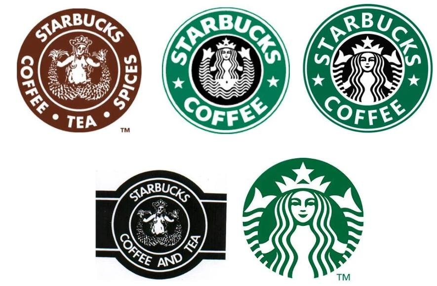
1971: The Birth of the Siren
Starbucks' maiden logo in 1971 embraced a coffee-brown color palette, symbolizing stability and warmth. The mermaid, a symbol of allure, held her twin tails in both hands. The circular design allowed for the company name to orbit around it, listing the offerings of coffee, tea, and spices, informing customers of their choices.
1987: A New Era Begins
When Howard Schultz acquired the company in 1987, the logo underwent its first evolution. Schultz enlisted artist Terry Heckler to reimagine it. The mermaid received a makeover - her hair now concealed her breasts, she retained her crown, and her overall appearance became sleeker. The color transitioned from brown to vibrant Kelly green, reflecting Starbucks' fresh start. "Tea" and "spices" were dropped, making way for a new wordmark - Starbucks Coffee - with two stars uniting the words, making it highly memorable
1992: A Closer Perspective
In 1992, Starbucks unveiled its third logo, offering a closer look at the siren. The font adopted a more modern and professional style. The resulting logo was cleaner and more impactful, with the siren taking center stage.
2008: The Bold Rebranding Misstep
To celebrate its 40th anniversary, Starbucks attempted a significant rebranding, revisiting the original 1971 logo in black. This move, however, met backlash as customers clung to the beloved green logo, demonstrating the potent bond between branding and logo.
2011: A Modern Facelift
Acknowledging the strength of their brand, Starbucks made a pivotal decision in 2011. They streamlined their logo, discarding elements like the wordmark and stars, putting the siren front and center, and enlarging her. Subtle changes to her features made her more symmetrical, and the iconic green background returned. This minimalist approach aimed to connect with a global audience successfully.
Design Lessons from Starbucks
The Starbucks logo's evolution holds valuable lessons for logo design. The consistent presence of their unique and recognizable mascot helped build a strong global brand identity. The circular design and emblem logo format proved versatile and timeless, adapting seamlessly to various platforms and media. Furthermore, the choice of vibrant green as a primary color projected compassion, nurturing, and kindness, reinforcing their brand values.